
Our last blog post on ideas for better visuals on social media received fantastic feedback—and lots of questions around imagery, colors and branding. So we decided to dive a little deeper and answer your most pressing questions.
Question 1: “Is the color graph in your last post universal or does it vary depending on region or country?”
Great question! Our previous post was focused mainly on the U.S. and U.S. brands. Lifehack has a great article on how colors are perceived by different cultures and religions all over the world, which is both useful and interesting to know—especially if you’re managing a global brand.
Question 2: “Do men and women perceive colors differently?”
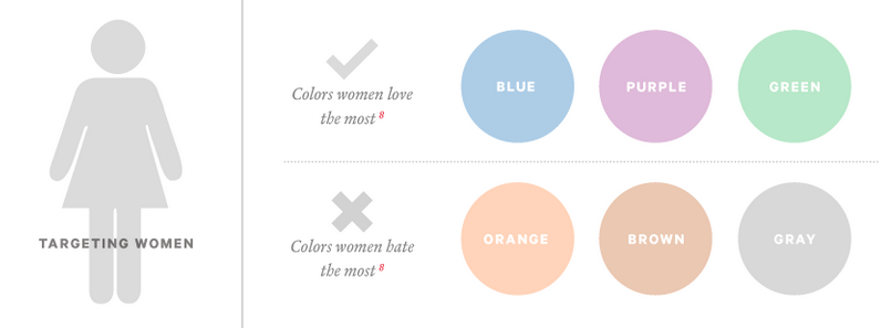
Fun question and definitely relevant if your brand is targeted to one gender over another (e.g., beauty or fashion). KISSmetrics suggests that women love blue, purple and green, and dislike orange, brown, and gray.
Have a look at these two graphics from Fast Company:
Source: Fast Company
In the case of men, the rules of the game are slightly different. Men love blue, green and black, but can do without brown, orange and purple.

Source: Fast Company
What do you think—do these findings apply to you?
More Tips on Using Color in Your Visuals
Smart marketers know that colors are more than just visually appealing—they can affect consumers psychologically.
Influential artist and educator Josef Albers once said, “Every perception of color is an illusion… we do not see colors as they really are. In our perception they alter one another.”
With that, here are 3 more tips as you develop the creative aspects of your digital marketing strategy.
Keep your target customer top-of-mind
Consider the above quote for a moment when thinking of your brand or business. When searching for and defining colors for your brand, think of your target audience and its concerns, desires, needs, hobbies, etc.
Use free or low-cost tools to define a color palette
Once you have identified your brand’s colors, create a color palette that is consistent across all your visuals and marketing materials. Essential tools like Palettab, Pictaculous, Color Story, ColourLovers, ColorZilla and Design Seeds can be lifesavers for marketers on a budget.
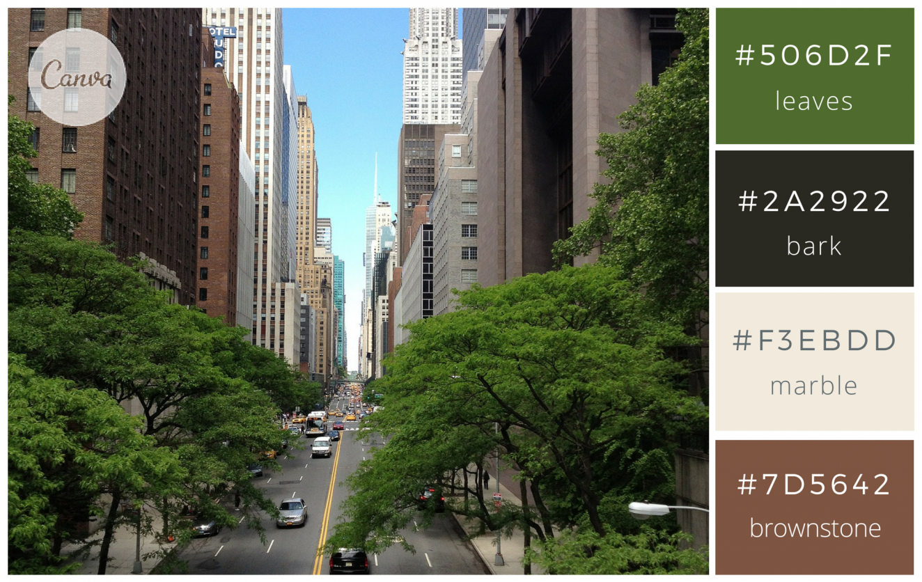
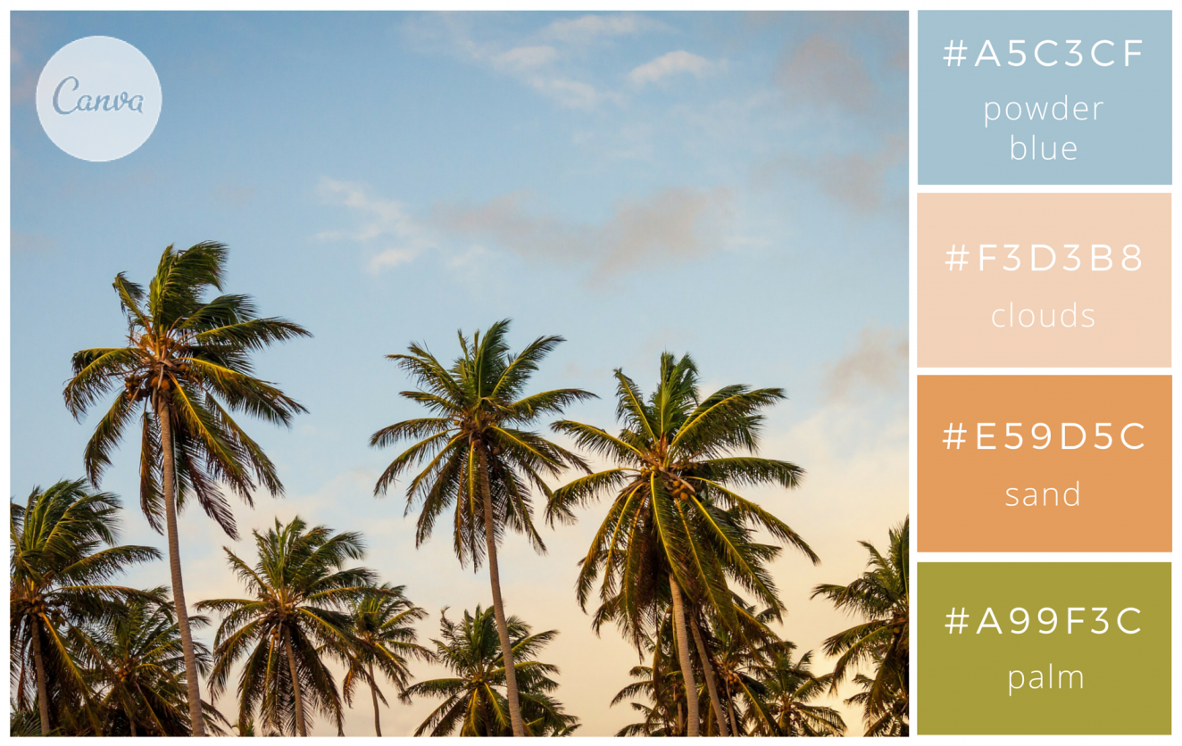
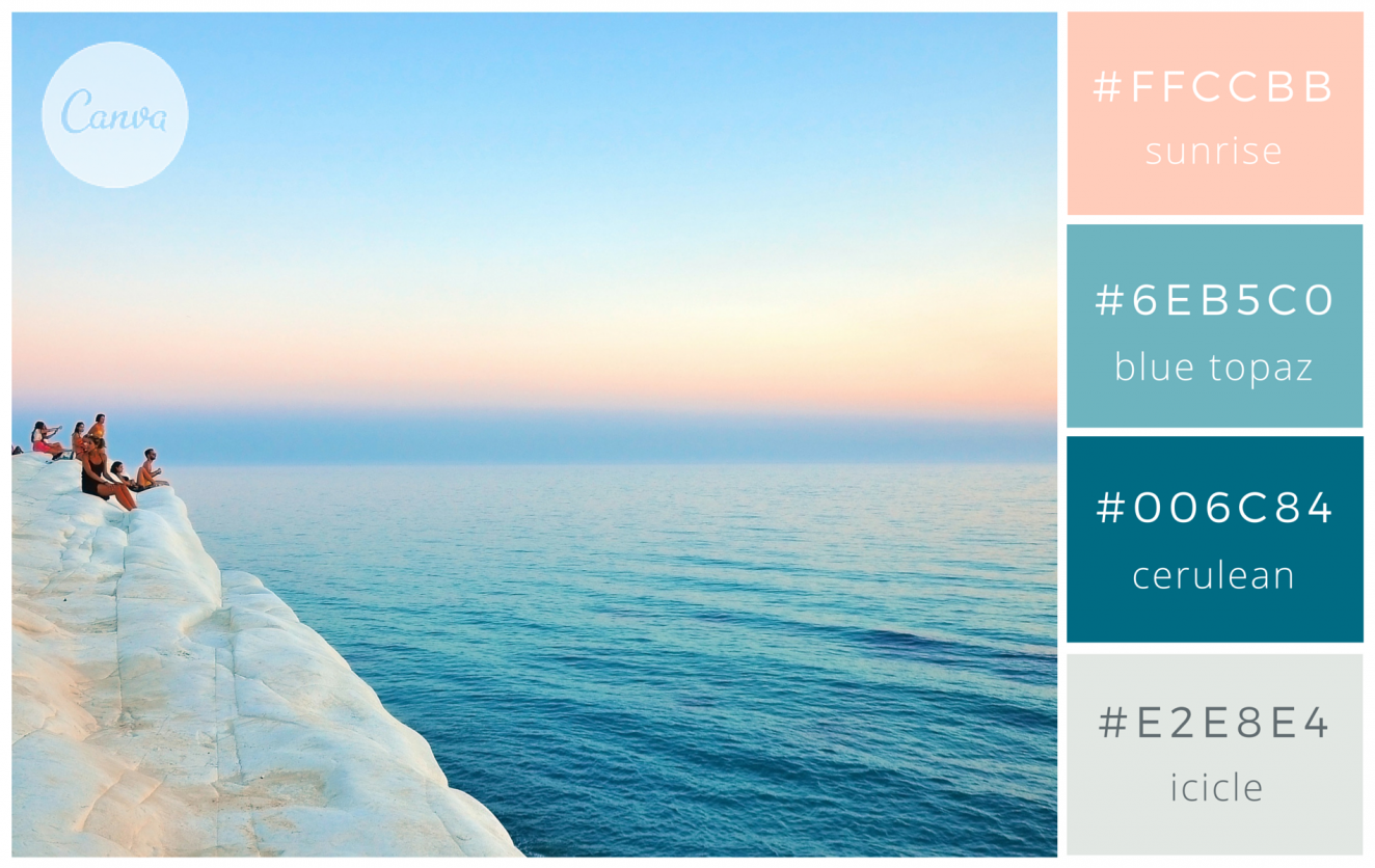
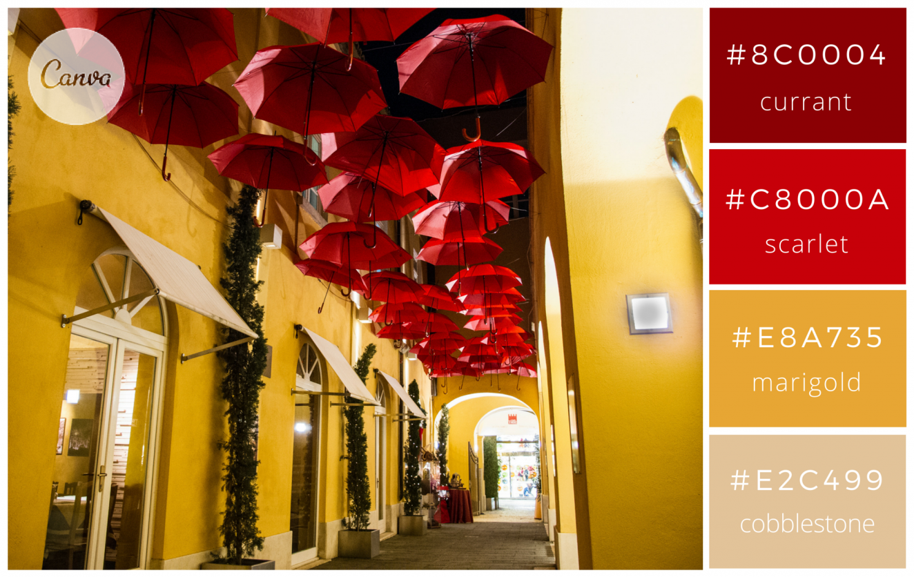
We understand it can be hard to know where to start when choosing a color palette for your design project. Luckily, the creative people at Canva have done the hard work for us—and included in the tool are 100 color combinations inspired by nature, food & drink, travel and everyday items.
Here are a few beautiful examples from Canva (with many more to peruse!):
You're not annie leibovitz—and that's OK
We also know how difficult it can be for small business owners (and even marketers at larger companies) to keep up with routine yet essential tasks on social media, like taking and finding usable photos.
Have you considered using free stock images to tell your brand story? No longer limited to cheesy poses and boring building shots, stock photography resources have really improved their offerings.
Our favorite sites for good photos are Gratisography, Unsplash, The Pattern Library and Foter.
We know human beings are highly visual—90% of the information we process with our brains is visual, and 83% of human learning is visual—so it goes without saying that the right colors, shapes, themes, people, etc., are a crucial part of your branding efforts. We hope you found this post helpful.
Have your own tips, or questions or ideas for future posts? Leave a comment below or give us a shoutout on social (we're @agencyguacamole).
-Mila // Team AG